This article explains the three main dashboards available in Flawless POS, Retail, Inventory, and E‑Commerce, and how to interpret the key charts and tables in each. Use this as a reference to understand your sales performance, stock status, and online activity at a glance.
Step 1: Review Retail Sales Overview (Month-to-Date and Year-to-Date)
The Retail Dashboard provides a high-level summary of your in-store performance.
In the Month-to-Date Overview, review:
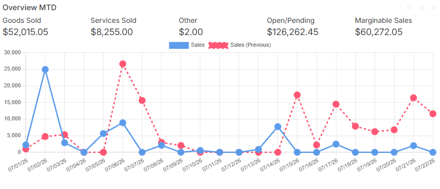
Goods sold
Services sold
Other items sold
Orders that are still open or pending
Total sales for the current month
In the Year-to-Date Overview, review the same metrics (goods, services, others, open/pending orders, and total sales) but aggregated from January 1 up to the current date.
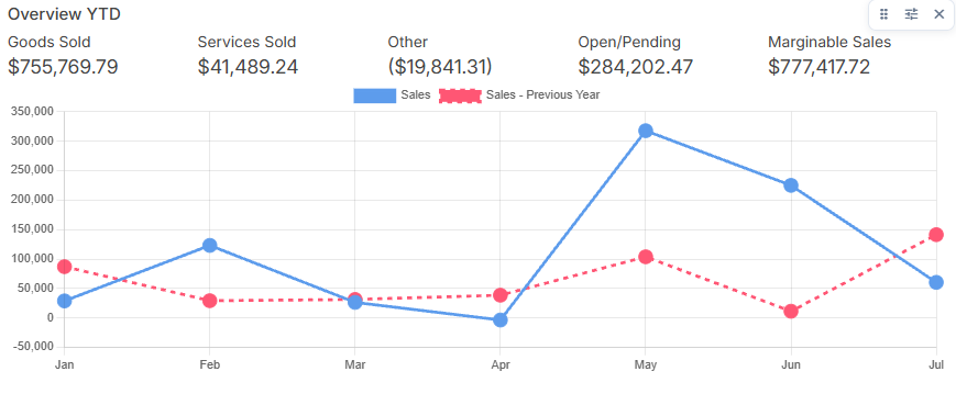
Use these two sections together to compare short-term and longer-term performance.
Note: Selecting any of the options on the top-right corner of each widget allows you to do the following: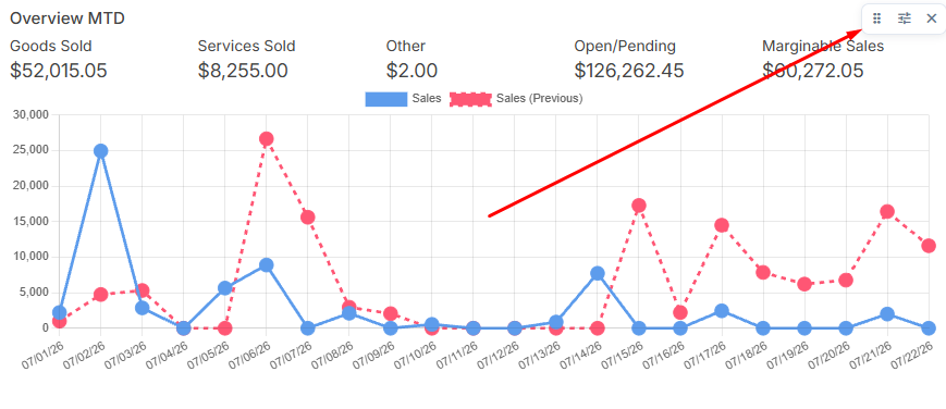
- Move the widget around
- Change the width of the widget
- Remove the widget from the view
Step 2: Compare Period Performance
Use the Period Comparison section to measure performance changes between the current period and a prior period.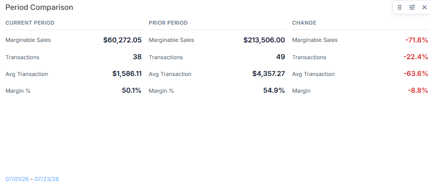
Locate the date selector at the bottom-left of the Period Comparison table.
Adjust the date to define your current period and prior period (e.g., change the period to February).
After updating the date, review:
Current period totals
Prior period totals
Percentage change between the two periods
From here, you can change the date to, for example, February or for the month of February and see how the current and prior periods update accordingly.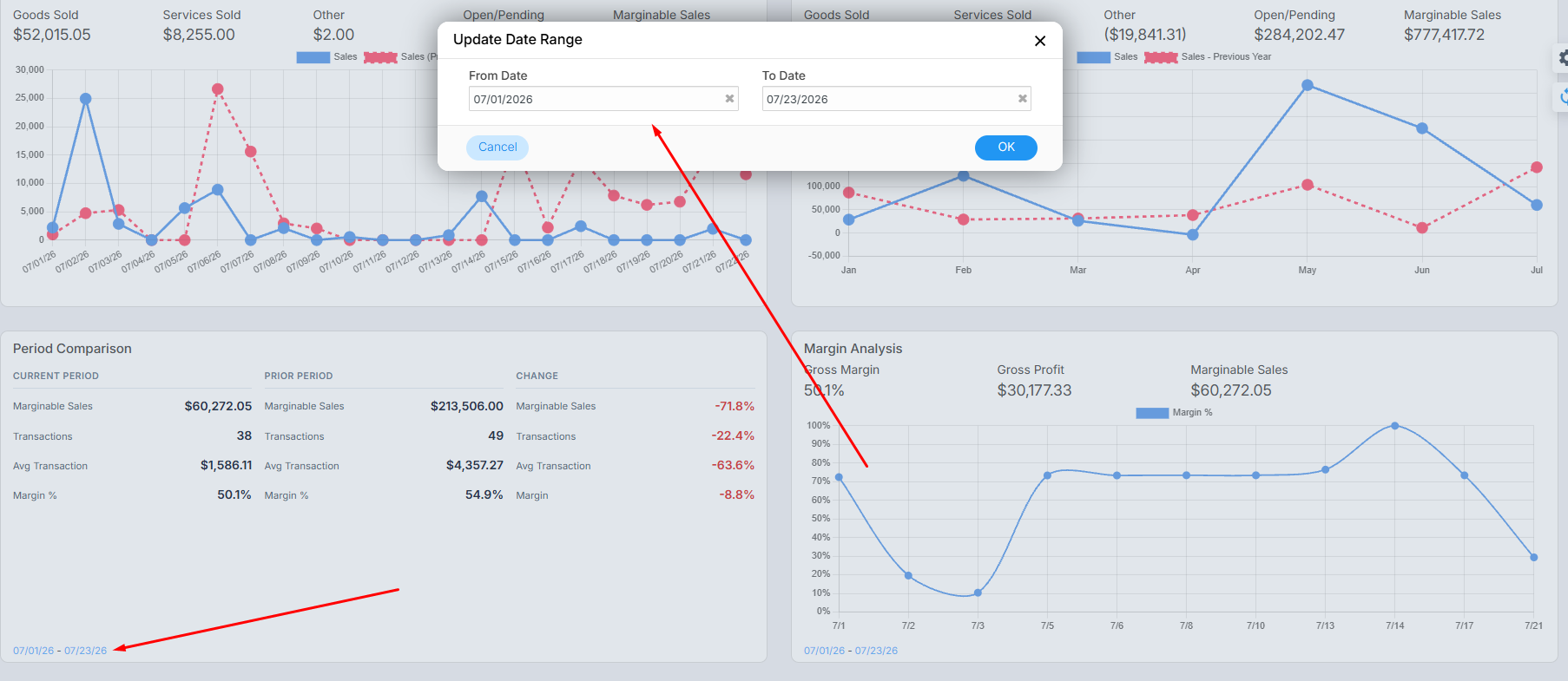
Step 3: Analyze Margins and Profitability
The Margin Analysis chart helps you understand profitability over time.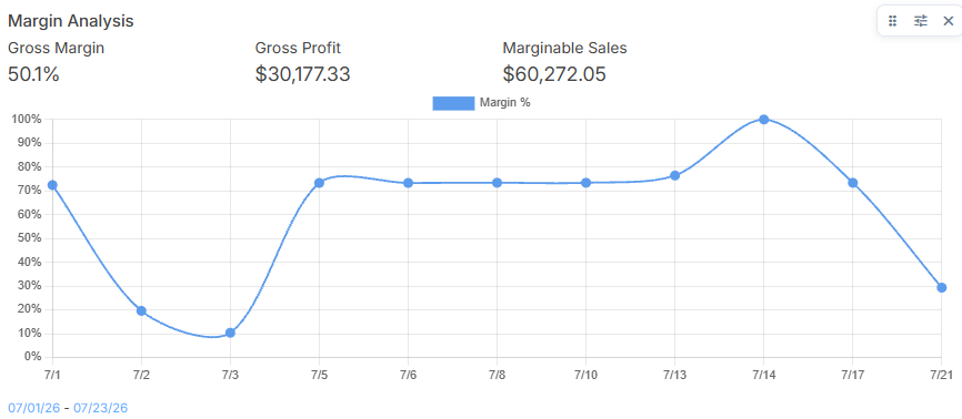
Review the chart to see:
Average margin
Total profit
Total revenue
Hover over specific points on the chart to see the exact dates and corresponding values.
Adjust the date filter for this chart to focus on a specific time frame.
You can change the date range to match the period you want to analyze.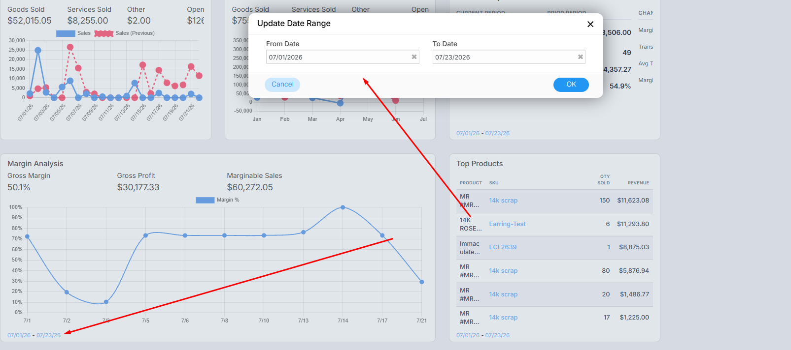
Step 4: Identify Top Products, Designers, Vendors, and Salespeople
Use the series of “Top” tables to understand what and who is driving your sales.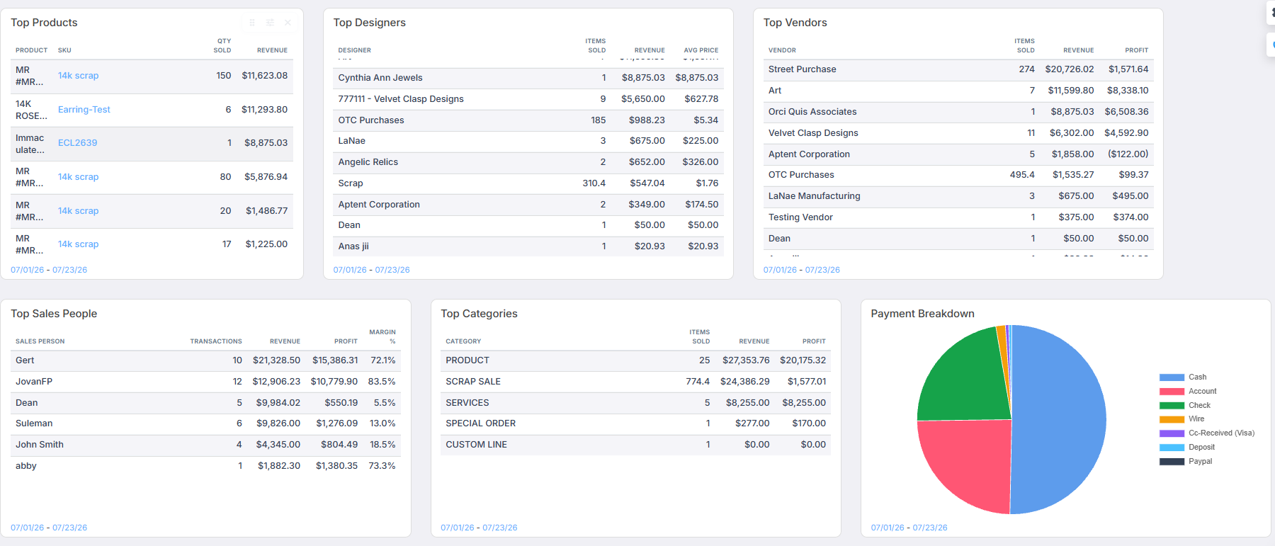
Top Products
Based on the selected date filter, review:
Quantity sold
Total revenue
Profit per product
Top Designers
See which designers sell most frequently:
Items sold
Revenue
Average price
Top Vendors
Similar to Top Designers, but organized by vendor:
Items sold
Revenue
Profit
Top Salespeople
Evaluate salesperson performance by:
Salesperson name
Number of transactions
Total revenue
Profit
Margin
Adjust your date filters as needed to focus on specific time windows or campaigns.
Step 5: Review Top Categories and Payment Breakdown
Understand how your sales mix and payment methods are distributed.
Top Categories
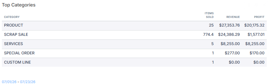
Review sales by category such as:
Services
Products
Special orders
Pick-up-later orders
Trade-ins
Other category types configured in your system
Payment Breakdown
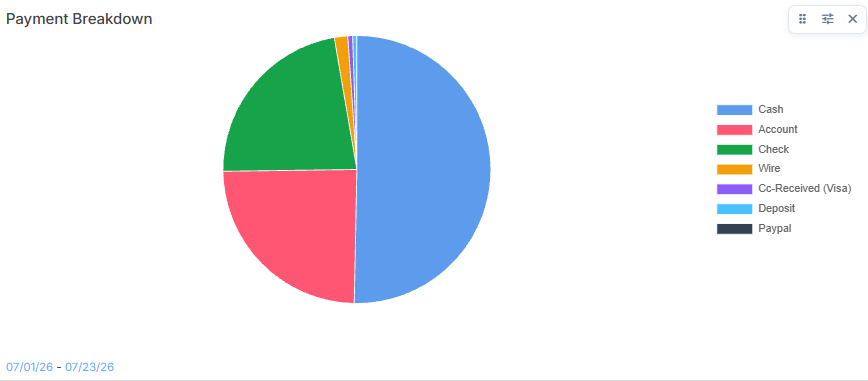
Check the legend and chart to see payments by method, such as:
Cash
Deposits
Account credits
Other configured payment types
Use these views to understand both what is selling and how customers prefer to pay.
Step 6: Monitor Unique Customers and Services vs. Goods
Track customer volume and the mix between services and goods.
Unique Customers
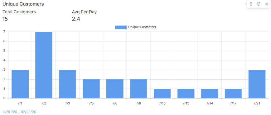
See:
Total number of unique customers served
Average customers per day
Hover over each bar to see how many unique customers visited on a specific day.
Services vs. Goods
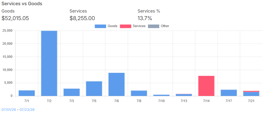
Review the distribution between:
Goods sold
Services sold
Check the percentage of services relative to total sales.
Remember: this view is based on the active date filter.
Step 7: Evaluate Sales by Hour, Recent Sales, Returns, and Open Sales
Use the detailed operational charts at the bottom of the Retail Dashboard.
Sales by Hour
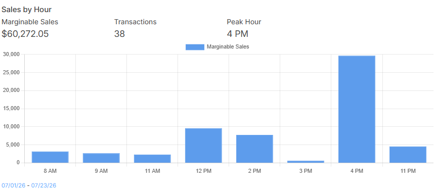
Based on the selected date range, review sales volume by hour (e.g., 11 AM, 12 PM, 1 PM, etc.).
Identify peak hours (for example, 5 PM may show as a peak in the chart).
Recent Sales
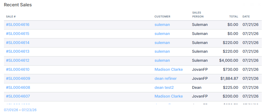
View a list of recent sales transactions, similar to the Recent Sales view in the Sales module.
Use this list to quickly verify recent activity.
Returns
Review all return transactions, including:
Return amounts
Dates of returns
Open Sales
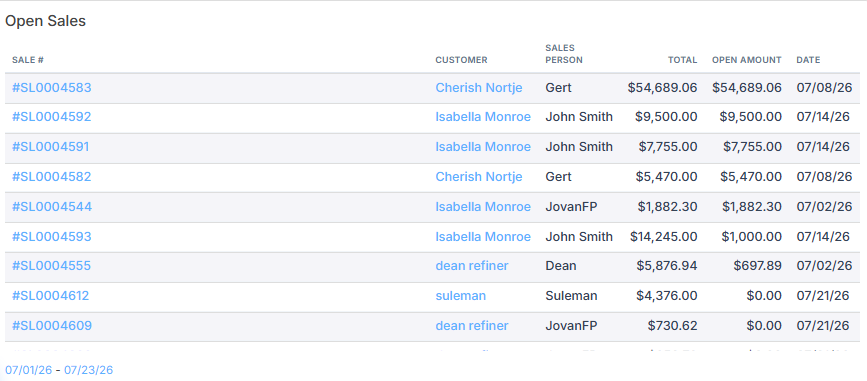
Check sales that are not yet picked up and are still awaiting customer collection (e.g., orders marked as “Pick up later”).
Use this to follow up on outstanding orders.
Step 8: Review the Inventory Summary
Switch to the Inventory Dashboard to analyze your stock status.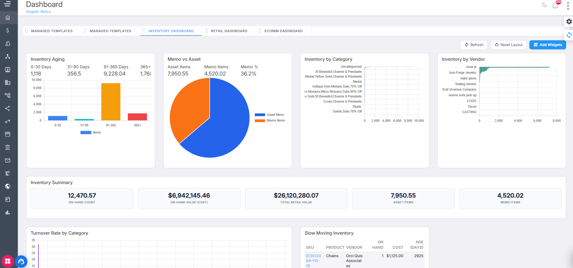
In the Inventory Summary, review:
On-hand count of total items
On-hand value cost (cost value of items on hand)
Total retail value (retail value of items on hand)
Asset items count
Memo items count
Note:
The on-hand count is the sum of asset items + memo items.
Use this to understand how much inventory you currently carry and its value.
Step 9: Assess Inventory Aging, Memo vs Asset, and Inventory by Category
Evaluate how old your inventory is and how it is distributed.
Inventory Aging
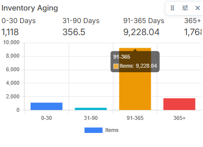
See how long items have been in stock (e.g., 0–30 days, 31–60 days, up to 365+ days).
Identify older inventory segments (e.g., items in the 365+ days bucket) that may need attention.
Memo vs Asset
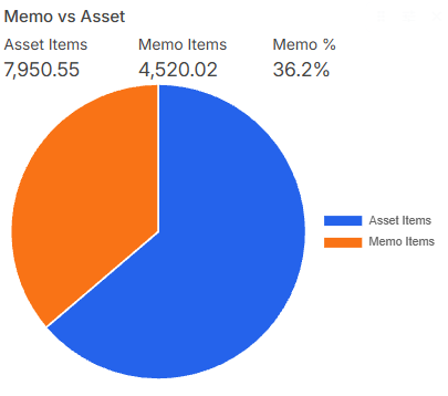
Compare:
Number of asset items
Number of memo items
Percentage of memo items
Quickly see whether most of your inventory is owned (asset) or memo.
Inventory by Category
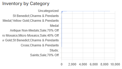
Review inventory grouped by category (e.g., rings, earrings, chains).
Hover over each bar or segment to see:
On-hand count per category (e.g., rings with an on-hand count of 815).
This helps you identify overstocked or understocked categories.
Step 10: Analyze Inventory by Vendor, Turnover Rate, and Slow-Moving Items
Use these views to optimize purchasing and reduce excess stock.
Inventory by Vendor
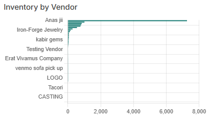
See which vendors have the highest on-hand counts.
For example, a vendor such as “Anas” may have an on-hand count of around 7,379 items.
Use this to manage vendor relationships and buying decisions.
Turnover Rate
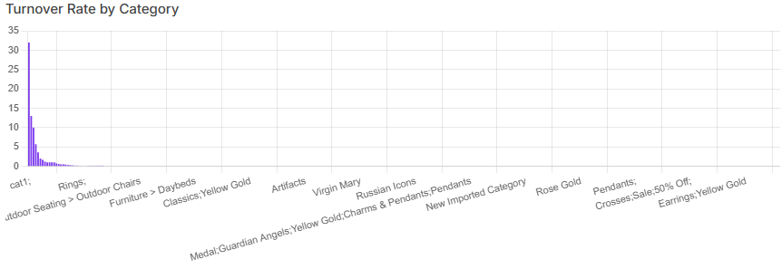
Review inventory turnover by category.
Identify which categories move quickly and which are slower, helping you plan reordering and promotions.
Slow-Moving Inventory
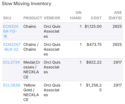
View products that have not moved for a long time (e.g., earrings or chains that have been in stock for 3,375 days).
Use this list to plan markdowns, promotions, or liquidation.
Step 11: Review E‑Commerce Overview and User Metrics
Switch to the ECom Dashboard to analyze your online store performance.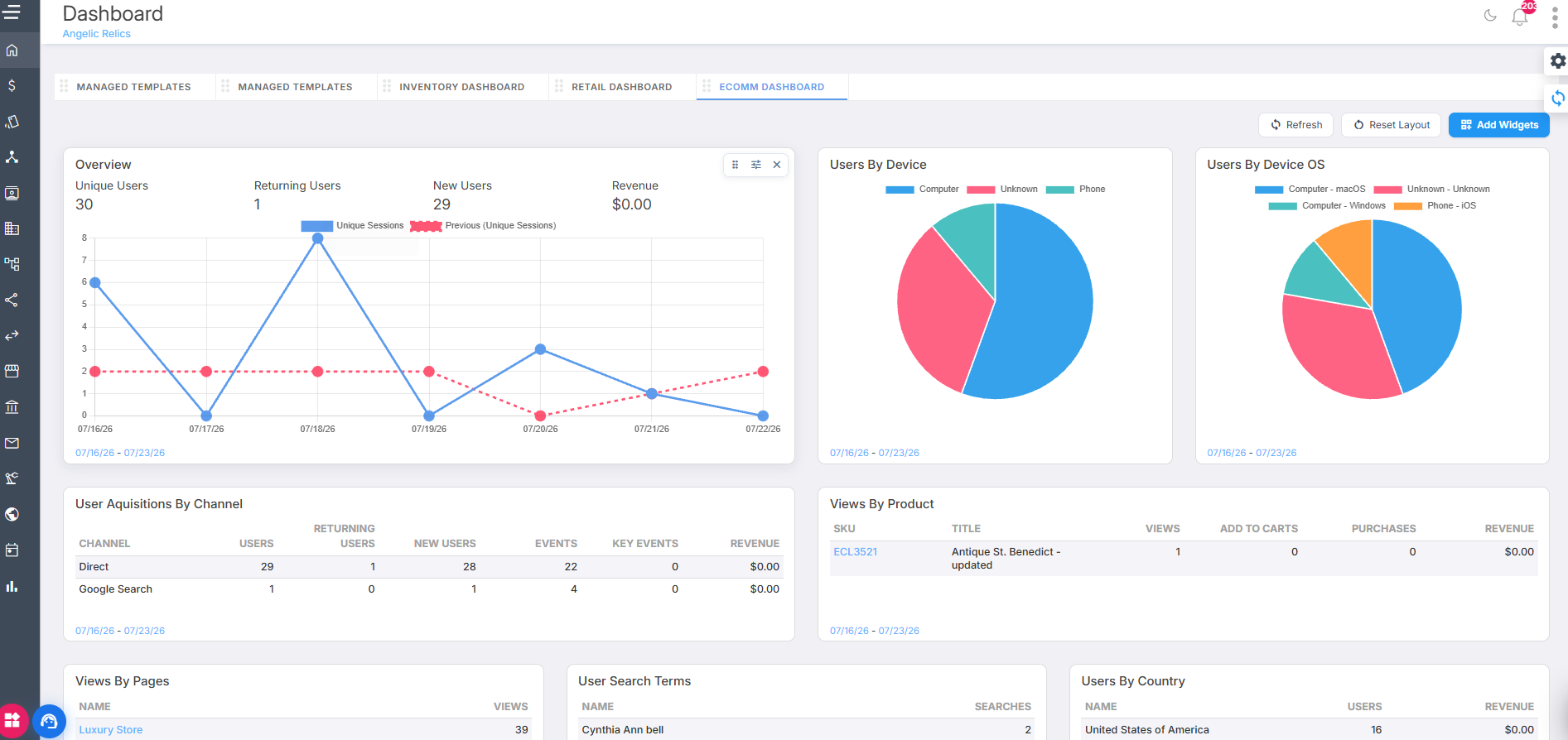
In the Overview section, review: 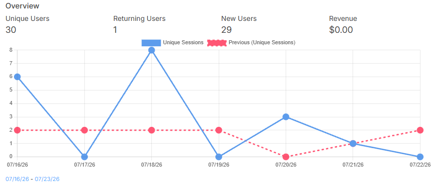
Unique users
Returning users
New users
Total online revenue
You can filter this dashboard by date to focus on specific periods.
Next, check:
Users by Device
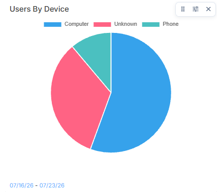
See how many users access the site via mobile phones vs. computers.
Users by Device OS
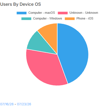
Review visitors by operating system (e.g., Linux, Windows, Android, other phone OS).
Use these insights to optimize your online experience for the most common devices and platforms.
Step 12: Track Acquisition Channels, Product Views, and Page Views
Understand how users find your site and interact with your products.
User Acquisitions by Channel

See how customers arrive at your website, such as:
Direct visits
Campaign links
Google Ads
Other marketing channels
Views by Product
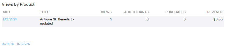
For each product, review:
Total views
Add-to-cart count
Purchases
Revenue
Views by Pages
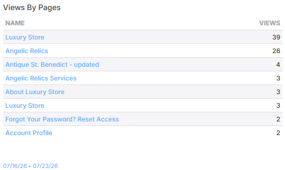
See how often key pages are viewed by customers.
Use this to identify high-traffic and low-traffic pages.
User Search Terms
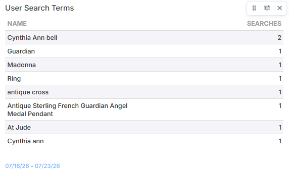
Review what customers type into your site’s search bar.
Use this information to improve product naming, tagging, and search relevance.
Step 13: Analyze Users by Country and Conversions by Channel
Measure geographic reach and channel effectiveness.
Users by Country
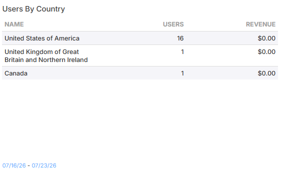
See how many users visit your site from each country.
Use this to understand where your online audience is located.
Conversions by Channel

Similar to User Acquisitions by Channel, but focused on conversions.
Review:
Item view quantity
Checkout quantity
Purchase quantity
Purchase amount
Use this to determine which channels drive the most effective checkouts and purchases.
Step 14: Evaluate Users by Campaign
Use the Users by Campaign section to measure campaign performance.
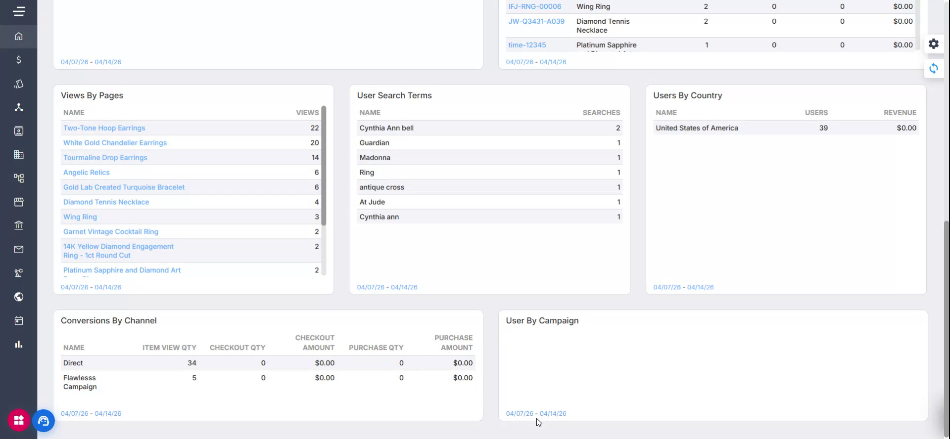
This view shows user activity for each campaign and is useful when you want to see how many users are visiting your site through specific campaigns.
Troubleshooting
For issues with configuring your Dashboard, please contact Flawless POS support for further assistance.
Was this article helpful?
That’s Great!
Thank you for your feedback
Sorry! We couldn't be helpful
Thank you for your feedback
Feedback sent
We appreciate your effort and will try to fix the article